There is a golden rule in product management when building an onboarding funnel: never let the user get distracted. You strip out the navigation, remove the footers, and create a "frictionless" tunnel where the only logical action is to click "Next."
But sometimes, that perfectly optimized, frictionless tunnel is exactly what's killing your conversion rate.
We learned this the hard way. I was CPO for an early stage startup, and we launched an AI-native marketplace in 2024 with what seemed like a brilliant idea: a purely conversational onboarding flow for sellers.
Early surveys told us sellers loved the concept of having an AI agent build their listing for them. So we built it. A seller would chat with our AI, the AI would extract the vehicle details, and boom — a perfectly crafted car listing. It felt like the future.
Until it hit reality.
Sellers did like the concept. But the execution was infuriating. AI is incredible at generation, but it is fundamentally terrible at iteration. If you've ever tried to work with an AI tool to generate a complex flow diagram, you know exactly how frustrating it can be — the first output is magic, but trying to get the bot to tweak one specific box is enraging. It's much faster to just drag and drop the box yourself.
Our sellers felt the same way. They wanted to tweak things—make a word bold, change a descriptor, adjust a price—and found themselves arguing with a chatbot instead of just clicking "edit." It was the equivalent of trying to drive a car with a joystick.
Sellers were bouncing immediately. No one wants to land in a chat interface when they expected a form.
Faced with those numbers, I had to swallow my pride. I realized our brand’s actual value wasn't in the novelty of an AI chat interface; it was in what happened after the car was listed. So I made the call to kill the chat-only flow and have the team build a traditional, multi-step onboarding flow.
The initial bounce rate plummeted. A huge win. We high-fived, celebrated the course correction, and moved on to the next fire.
But then our numbers stalled. We had solved the initial bounce problem, but we were seeing massive mid-stream abandonment. Users would get halfway through the flow and then just vanish. We had hit a plateau, and the usual CRO playbook wasn't giving us answers.
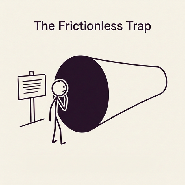
The "Best Practice" Trap
When a standard product funnel stalls like this, the instinct is usually to make it more frictionless. This is the precious "golden rule" of conversion optimization: Product managers love building "tunnels"—distraction-free, locked-in flows where the only logical action is to click "Next." Remove the headers. Remove the footers. Trap them in the flow until they finish.
But when a user is deciding which platform to trust with the sale of a $20,000 asset, they aren't behaving like someone buying a pair of socks on impulse.
I dug into the analytics and noticed a quiet but persistent pattern: a significant percentage of users were trying to "ping-pong" between the onboarder and the main content pages of the site. They would start the flow, get nervous, and try to navigate back to the FAQs or the pricing page to answer a question that had popped into their head.
Because we had built a "best practice" frictionless tunnel, there was no navigation menu. The only way out was to hit the browser's back button. And when they did that, they lost all their progress.
They weren't abandoning mid-stream because the flow was too hard. They were abandoning because they felt trapped before they were ready to commit.
Building an Escape Hatch
I decided to run an experiment that broke the golden rule of onboarding funnels: we added universal global navigation enabling users to exit the locked-in flow, and ensured the system maintained their state if they wandered off.
Instead of locking them in, we gave them an escape hatch. If they were on Step 3 and suddenly panicked about what our fee structure was, they could click the hamburger menu, go read the pricing page, and (crucially) easily navigate back to where they left off without losing a keystroke.
By actively facilitating that ping-pong behavior instead of fighting it, the results weren't subtle. Giving sellers the freedom to leave the flow resulted in a 3x (300%) increase in conversion rate for paid listings.
By removing the "frictionless" constraints, we actually removed the anxiety.
Are You Optimizing or Trapping?
This isn't about whether global navigation belongs in a checkout flow. It’s about recognizing when your product’s architecture is fighting the user's natural psychology.
Look at your highest-abandonment flow right now. Are users dropping off because the next step is confusing, or are they dropping off because you’ve trapped them in a tunnel when they still need to establish trust?
If your analytics show users repeatedly trying to access information you've deliberately hidden from them in the name of "conversion optimization," you don't have a UX problem. You have a trust deficit.
The fix isn't to make the tunnel smoother. It's to let them out.
The Next Play
If this resonates with the stage you're at right now, join Closing the Loop for a weekly, unvarnished look at the strategic decisions that actually move the needle.